Kepler.gl and Census Data
Kepler.gl and Census Data
I recently discovered a kepler.gl extension for Python and wanted to try out some of its features. I used some census data I had previously downloaded to create a very simple map of count of people over the age of 65 in California counties. Below is my typical workflow for an exploratory analysis of LA County demographics and California overall.
import pandas as pd
import geopandas as gpd
from plotnine import *
age_ethnicity = pd.read_csv('data/csv/ca_counties.csv')
age_ethnicity.head()
| GEOID | NAME | value | SEX | AGEGROUP | HISP | |
|---|---|---|---|---|---|---|
| 0 | 6047 | Merced County, California | 277680.0 | Both sexes | All ages | Both Hispanic Origins |
| 1 | 6047 | Merced County, California | 108238.0 | Both sexes | All ages | Non-Hispanic |
| 2 | 6047 | Merced County, California | 169442.0 | Both sexes | All ages | Hispanic |
| 3 | 6047 | Merced County, California | 21268.0 | Both sexes | Age 0 to 4 years | Both Hispanic Origins |
| 4 | 6047 | Merced County, California | 5821.0 | Both sexes | Age 0 to 4 years | Non-Hispanic |
la_age_ethnicity = age_ethnicity[age_ethnicity['NAME'] == 'Los Angeles County, California']
la_age_ethnicity = la_age_ethnicity[la_age_ethnicity['HISP'] != 'Both Hispanic Origins']
la_age_ethnicity = la_age_ethnicity[la_age_ethnicity['SEX'] == 'Both sexes']
la_age_ethnicity = la_age_ethnicity[la_age_ethnicity['AGEGROUP'].str.contains("^Age", na=False)]
la_median = age_ethnicity[(age_ethnicity['NAME'] == 'Los Angeles County, California')&
                          (age_ethnicity['HISP'] == 'Both Hispanic Origins')&
                          (age_ethnicity['SEX'] == 'Both sexes')&
                          (age_ethnicity['AGEGROUP'].str.contains("Median", na=False))]

la_median = la_median['value'].values[0]
def over_65(x):
    if x >= 26:
        return "Over 65"
    if x < 26:
        return "Under 65"
    else:
        return "Other"

la_age_ethnicity = la_age_ethnicity.sort_values('AGEGROUP', ascending=True)
la_age_ethnicity = la_age_ethnicity.reset_index()
la_age_ethnicity = la_age_ethnicity.drop('index',axis=1)
la_age_ethnicity = la_age_ethnicity.reset_index()

la_age_ethnicity['over_65'] = la_age_ethnicity.apply(lambda x: over_65(x['index']),axis=1)
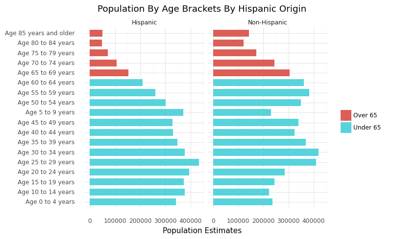
LA County Age Distribution Chart
From the chart below, we see that there is a larger demographic of older non-hispanic residents in LA County compared to Hispanic residents with slighly even distributions of younger residents. This can be important data used in various lenses especially in context of COVID19 since generally the older population are more at risk.
ggplot(la_age_ethnicity, aes(x = 'AGEGROUP', y = 'value'))+\
  geom_col(aes(fill = 'over_65'),width = 0.7)+\
  facet_wrap('~HISP')+\
  theme_minimal(base_family = "Roboto")+\
  labs(x = "",\
       y = "Population Estimates",\
       title = "Population By Age Brackets By Hispanic Origin",\
       subtitle = "Los Angeles County, California",\
       fill = "",\
       caption = "Data source: 2019 US Census Bureau Population Estimates")+\
   coord_flip()
General Spatial Exploratory Data Analysis
Below is a typical workflow when working with any type of spatial data including census data. We start with having an empty shapefile make adjustments to our data to be able to join them together to make a map
counties_shp = gpd.read_file('data/shp/California_County_Boundaries/cnty19_1.shp')
ca_age = age_ethnicity[(age_ethnicity['SEX'] == 'Both sexes')&
                       (age_ethnicity['AGEGROUP'].str.contains('65 years and over', na=False))]

def geoid2fips(x):
    x = str(x)[-3:]
    return(x)


ca_age['FIPS'] = ca_age.apply(lambda x: geoid2fips(x['GEOID']),axis=1)
counties_shp = counties_shp.drop_duplicates(subset=['COUNTY_FIP'], keep='first')
ca_merge = pd.merge(counties_shp,ca_age, left_on='COUNTY_FIP', right_on='FIPS')
ca_merge=ca_merge.to_crs(epsg=4326)
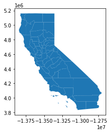
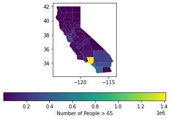
Choropleth Maps
The most common map made with census data is known as the choropleth map. Generally speaking, to make this type of map we color in our geographies according to a specified variable. Below is the most basic way to make a hasty map using the base geopandas library. From below we see SoCal generally has more older residents with LA County having the most. As a caveat I would like to mention that we typically normalize our data by the underlying population to get a better sense of what the data is in context to the population.
The below maps do not normalize by population and is only being used to demonstrate what a choropleth looks like in geopandas and kepler.gl
import matplotlib.pyplot as plt
fig, ax = plt.subplots(1, 1)
ca_merge.plot(column='value',ax=ax,legend=True,legend_kwds={'label': "Number of People > 65",'orientation': "horizontal"})
Kepler.gl
In 2018, Uber Engineering released their Kepler.gl program to the open source community along with a python extension. Although this doesn’t explore the full capabilities of the app, below is a simple example of how to take census data and make a Kepler.gl choropleth map.
Note* Set up does take a bit of legwork and instructions and resources are linked below
choropleth = KeplerGl(height=800, data={'Number of People > 65': ca_merge.to_json()}, config=config)
User Guide: https://docs.kepler.gl/docs/keplergl-jupyter